Tell us more about you: Designing theCOOP interest form
theCOOP is an accelerator program focused on helping bootcamp graduates break into the engineering and design fields faster by providing them with real-world experience.
My Role
Developing this training program was the labor of many, and while my colleagues focused on other aspects of building the program, I went to work on designing a native form for the company website.
Tools
Zoom
Figma
Miro
Overview
New bootcamp graduates, particularly those coming from completely different industries had yet to develop the skills and confidence to hit the ground running in a new job. Having been a bootcamp grad myself, I understood the struggle to find the right next step for skill-building. Word was getting around about what we were up to, and friends of friends were reaching out to members looking for a way into theCOOP.
Bootcamp grads needed a way to let theCOOP know they were interested in joining.
Handed a design brief by the project manager describing the task at hand, I was responsible for designing a prospective member intake form. This case study takes you through how I went about doing just that.
Research
User Goals
The requests we received seemed pretty straightforward but understanding the deeper issue of not having a clear point of contact and their goals for reaching out were made very clear as we discussed the inquiries as a team. Recurring themes were:
Letting theCOOP know “I want in”
Get more information on how to join
What do I have to do to stand out and get in?
We needed to keep it simple and thoughtful. Our users just went through a whirlwind at bootcamp, are excited about their newfound skills, and were frustrated with the job search. They were already being judged by employers in a competitive market - we didn’t want anyone feeling like this was one more thing to compete for by showing off what they could do. Caring more about their desire to learn, we wanted to do our best to not make this feel like a job application.
Defining the MVP: What do we need to know and how do we get it?
The form’s purpose is two-fold, of course, it provides a way for bootcamp grads to get in touch and it also helps the business reach its goals:
Capture emails and other pre-registration information
Get a baseline understanding of why people want to join
Collect data to support our assumption that theCOOP’s service was needed
After sitting with the program founder to determine what information would be useful to know about potential members, we used Google for the first form and linked it to the site. Having this in place would provide users with a means to communicate their interest, allow us to start collecting potential member data asap, and buy some time while I worked on designing a native version.
Most importantly, we wanted to funnel users to the correct set of questions, since each was tailored to a specific discipline. Using the Google form at this stage was incredibly useful in my design process since it put the focus on the data and not on the UI.
Design
Sketches
With the interim form doing its job, I got to work on researching UI patterns and coming up with some iterations. Laying out a sketch of the flow in Miro helped me to visualize the best design approach and create my checklist of must-haves for the design.
These were the priorities to keep in mind as I moved into the design phase:
Keep it simple. Chunk it.
Use labels and placeholders.
Clear and understandable language.
Give users feedback.
Design decisions
I came across a ton of information on form design, so many experiences, examples, do’s and don’ts. These are a few of the design decisions I made based on the research I’d done:
Progress steps - Being a multi-step form, I wanted the user to know how far along they were in filling it out. Spoiler alert: The progress steps ultimately didn’t make it into the final design.
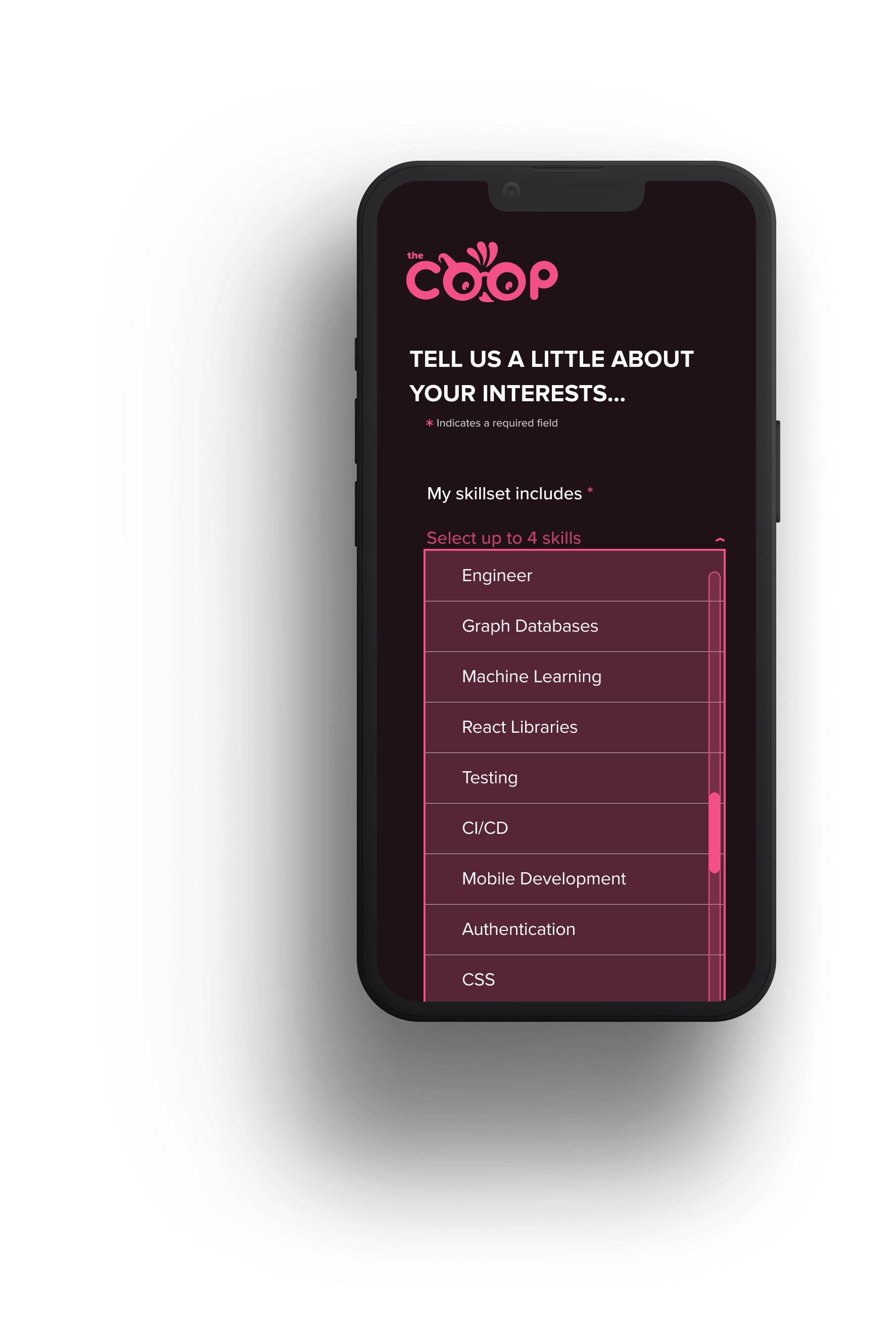
Chiclets - Used to visually represent selections from the dropdowns, these give the user the ability to easily see and edit their selection without having to scroll through the list again.
The dropdown - I went with dropdowns in order to conserve screen space and give users the ability to select from a specified list of options.
The final design
Keeping aesthetics in mind but not letting it lead the charge, I designed with familiar UI patterns in mind, and most importantly prioritized user goals and functionality. The screens below are some examples of the final design… scratch that, design is never final.

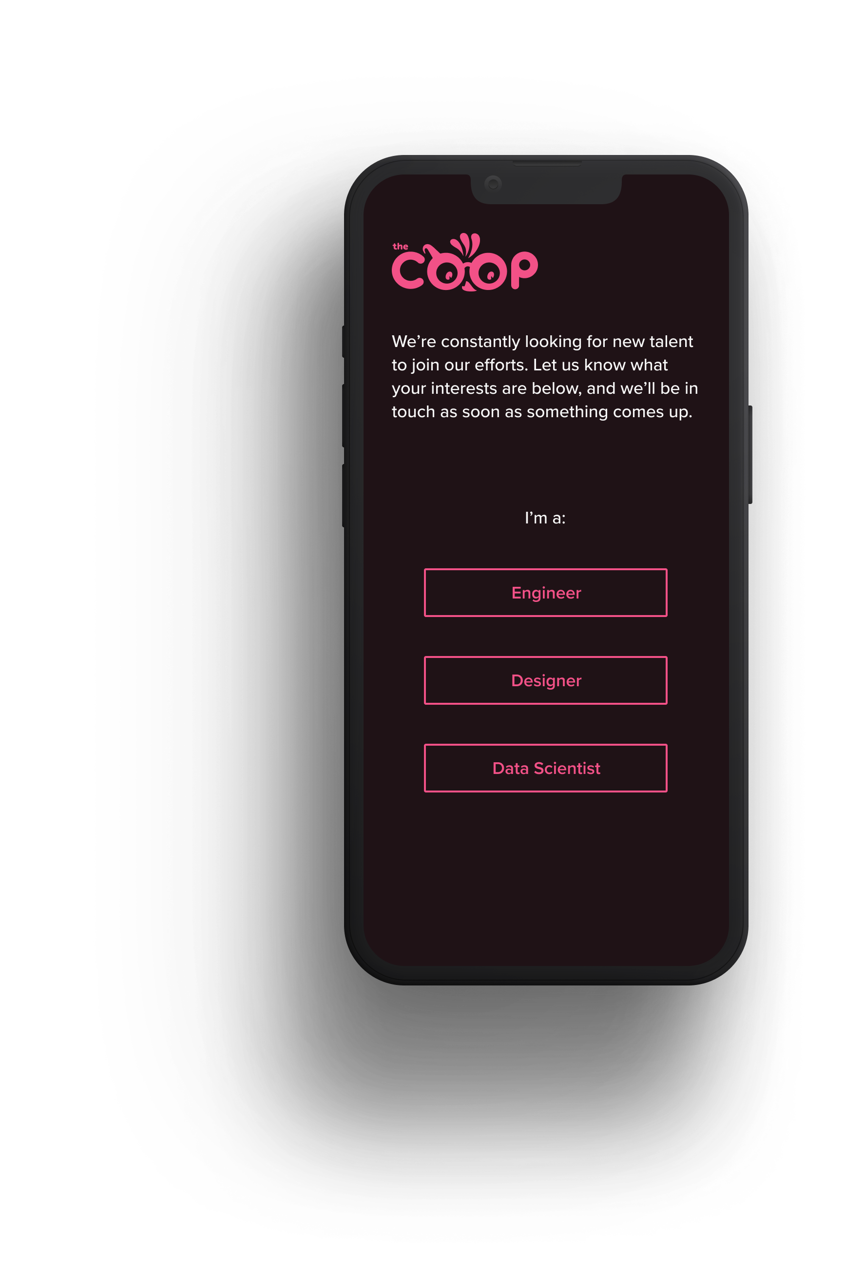
After initiating contact via the website "Join Us" button, I guide the user to the appropriate set of questions, defining a clear path.
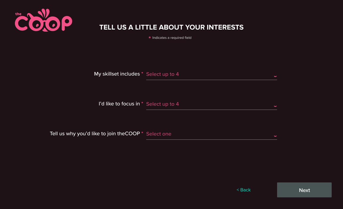
The design takes up the full screen to avoid any distractions, which leads to a more likely form submission.
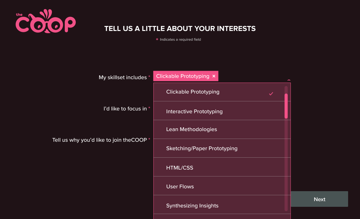
The dropdown offers limited options for easier completion, and chiclets allow them to easily view and edit their selections.
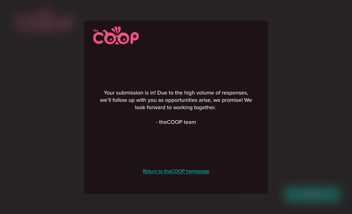
Even though submitting the form automates a confirmation email, instant feedback lets the user know the submission is complete.
![[Mockup] iPhone 13.png](https://images.squarespace-cdn.com/content/v1/5fa2d6bc8bcab262e80e6e55/84d0bd70-df67-4445-a915-5056f40460c3/%5BMockup%5D+iPhone+13.png)
What I Learned and Next Steps
Ok, so my form isn’t perfect. I made some rookie mistakes, but I learned a lot. From working with engineers and understanding technical constraints to handing it off for development and suddenly realizing I’d missed the mark on some key factors, there is definitely room for improvement.
Based on my own assessment, here are a few ways the form could be better:
I would take the placeholder text out of the input field since the instruction disappears when the user makes a selection - how are they supposed to know how many selections they can make?!
Reconsider label placement. There’s an argument for left-aligned labels, but the majority of research on best practices points to always placing the label above the input field.
Unfortunately, the native design didn’t make it past the development phase, but if given the chance for next steps, I’d put the form to the test with users to see if the design indeed provided the frictionless user experience I was aiming for. Usability tests would also help to highlight other areas of improvement aside from the ones I see myself.

