A mobile financial education experience.
fINEQUITY is a seed-stage nonprofit committed to advancing the financial futures of community members who have experienced long-term incarceration, empowering them through education and access to safe financial products as part of their reentry journey.
Role
Researcher + Product Designer
Duration
3 Weeks
Tools
Figma, Miro, Zoom
Problem
Users need a way to learn to make credit decisions.
Due to long-term incarceration, users have limited financial knowledge, which in turn limits their freedom to reach their goals.
Challenges
The client did not have a digital experience available meaning the entire project had to be designed from scratch.
The existing platform did not provide real-time feedback.
Users may have never had the opportunity to learn what a credit score is or how it works.
Existing User Flow
Research
Competitive Analysis
Researching the competitive landscape I found a lack of focus on users within the target population in the direct competitor segment. The process helped me pinpoint areas of opportunity and key areas of impact for fINEQUITY.
User Interviews
Key Takeaways
Users are faced with making decisions after being removed from society for 7+ years and trying to move forward without a full understanding of how to navigate decision-making.
They need access to basic credit education that is practical.
They need a mechanism to build credit.
Learning about credit was important to them, but understanding how to navigate the credit-building process and building it safely was the number one concern.
Setting Priorities
Based on learnings from our research, we developed a Persona and used a MoSCoW analysis to help us clarify priorities and begin ideation. The biggest challenge going into this project for our team was scope, so we had to be incredibly resourceful with where we focused our time. With that in mind, we agreed the priority was to focus on basic core features that we knew would meet their needs.
A way for users to access the content
A way for users to learn about making financial decisions
A way for users to build credit
“I feel like I'm always struggling to get the things that I need. I don't know how to fix my credit, so I'm figuring it out as I go”
— User Quote
Design
Ideation
Honing in on the user’s problem of "figuring it out as they go" and learning to navigate the credit-building process, I focused on an educational feature to meet user and business goals. Research provided me with a few data points to guide my ideation:
Users were already playing games on their mobile phones,
Studies have shown that choose-your-own-adventure gamification platforms are a recommended teaching method that increases student performance as well as student engagement.
Wireframes
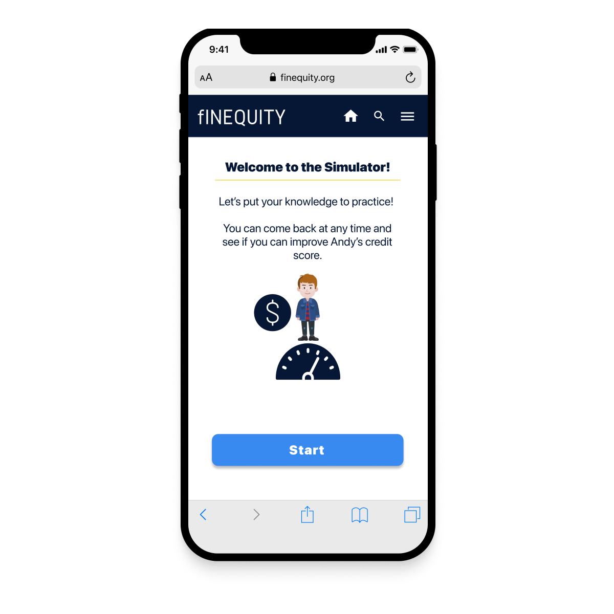
As a result of my research, I transformed sketches into wireframes and performed usability tests to validate the concept. The "Simulator" is a gamified learning activity based on presenting users with common financial decision-making scenarios, giving them the freedom to learn by doing.
Design Features
-

Onboarding
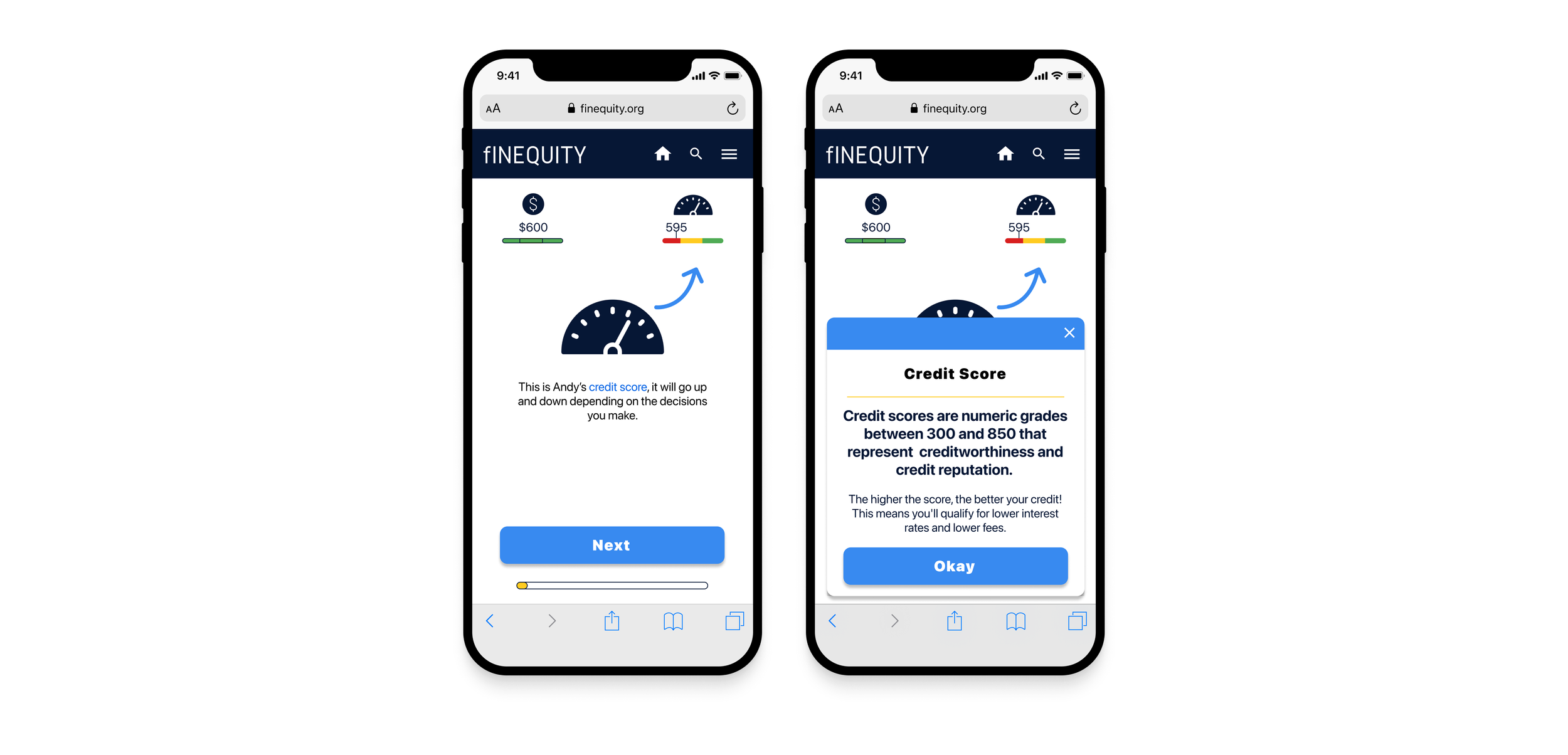
Keeping in mind that users may have limited experience with technology, to facilitate the user’s experience, a new user is walked through an onboarding tutorial. It was essential to incorporate an instructional component and straightforward language to guide the user.
-

Linked Key Terms
Linked key terms give the user quick access to definitions without having to leave the application.
Ensures the design works for a broad audience
Relieves the cognitive load of trying to recall a term, and
Empowers the user by filling potential knowledge gaps, without being cumbersome for people who may not need the additional information.
-

Scenarios
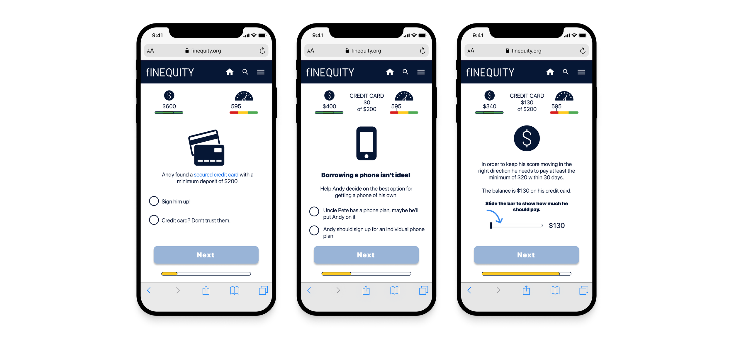
The Simulator presents the user with everyday scenarios, allowing them to practice decision-making and gain an understanding of the credit-building process. As they choose their own path, users have visibility into how their decisions affect the budget and credit score meters.
-

Results
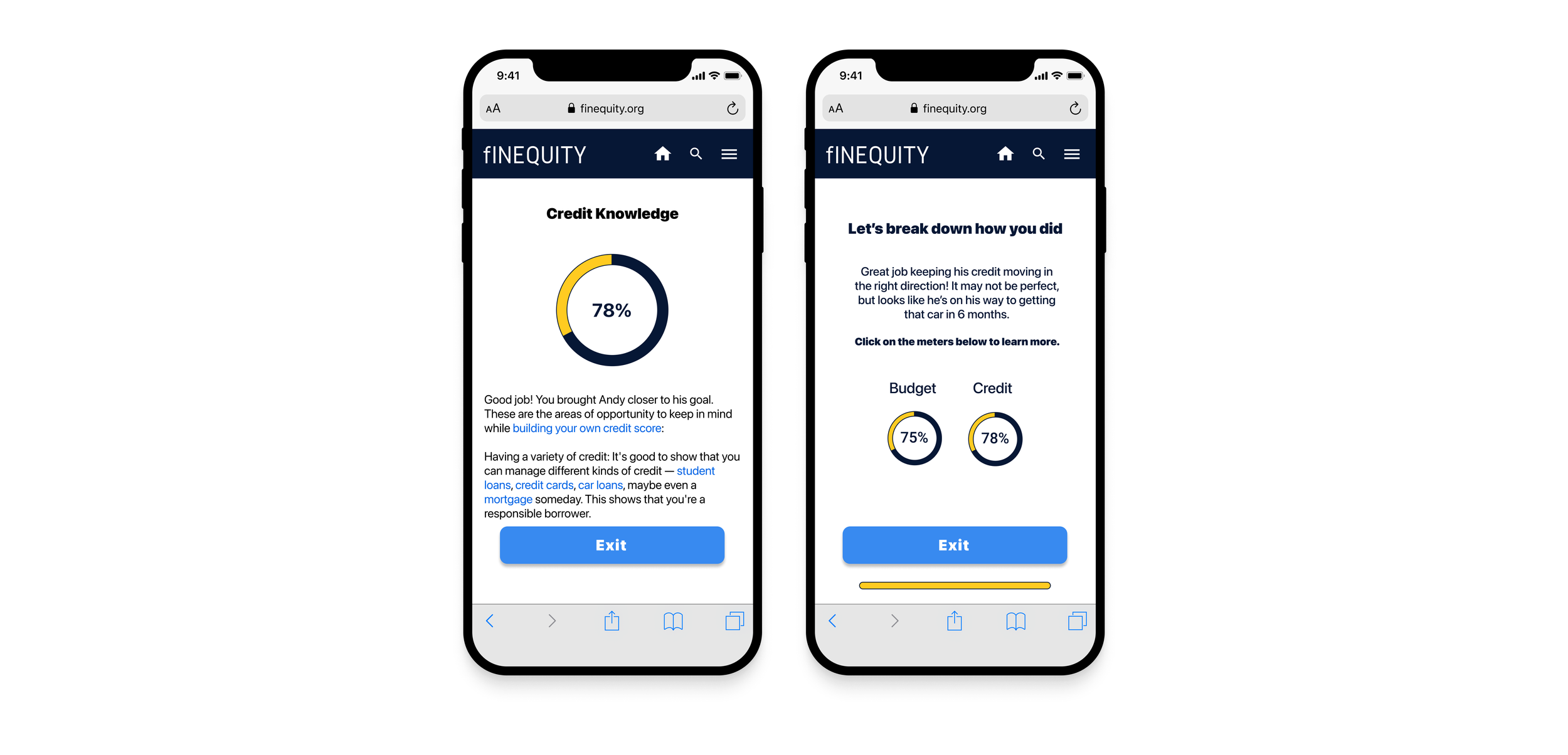
Once the user gets to the end of the activity they receive a summary of their score in each category. Each result component expands to provide more detail on relevant topics and links to dive deeper into financial concepts. By providing this feedback, users are given more information to fill knowledge gaps.
Usability Test Report
User testing was a success, identifying the simulator as a viable educational tool that produced high engagement results.
Users related the avatar to being able to control a fictitious version of themselves before actually getting out into the real world.
Users noted that with the simulator they can start again, something they can’t do as easily in real life.
Moving forward, more research and testing are required to ensure that the scenarios are believable and in line with credit-building realities.
What I Learned
The simulator met the objective of adding a feature to educate and engage the user - goal achieved! Nonetheless, it would have benefited us to test the traditional information/quiz method they used to compare with the simulator.
Overall, this was an incredible learning experience. Ownership over the new feature design allowed me to dive into research, learn to defend my design decisions, and contribute to a meaningful mission.

