CEED: Website Redesign
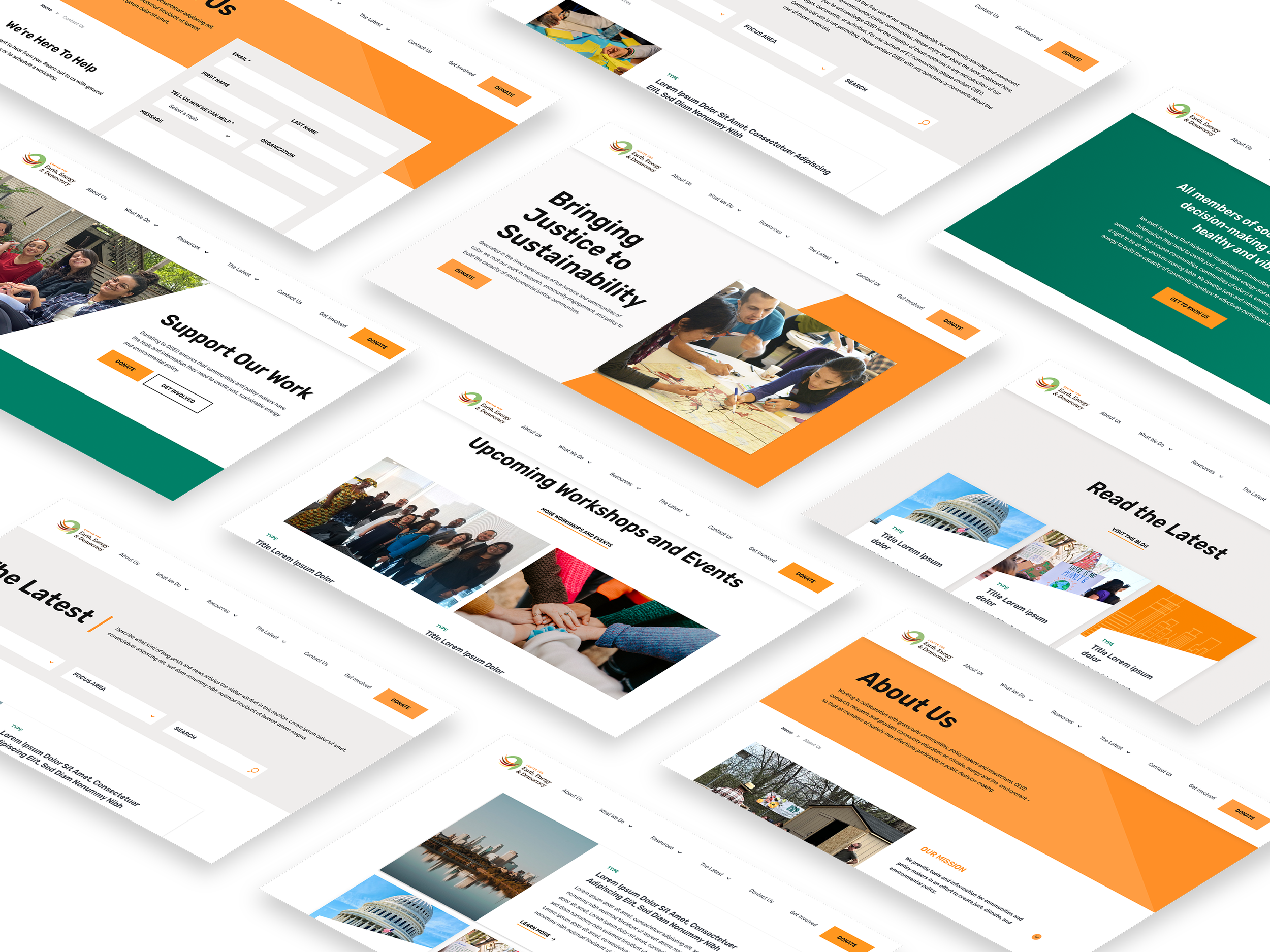
With a focus on environmental justice, the Center for Earth, Energy, and Democracy “CEED” is a passionate team that ensures communities and policymakers have the tools and information they need to create just sustainable energy and environmental policy. Through strategic research, I improved the overall user experience and delivered an engaging, scalable design.
Role
UX/UI Designer
Duration
8 Weeks
Tools
Figma, Photoshop, Slack, Zoom
Overview
CEED relies on its site to provide information and tools to inform people about pollution sources in their communities. I partnered with the Karma, Resource Media, and Chee Studio teams to design a refreshed web experience that is easy, informative, and as vibrant as our client.
Challenges
Accessibility: Low-contrast text copy
Long solid copy that is not easily scannable
Limited high-res images
Missing calls to action
Cumbersome navigation
Research
Collect information → Analyze data → Find patterns → Organize ideas
Auditing existing information, I found multiple opportunities for improvement to the design strategy.
Accessibility
The project brief included an existing style guide and a previously approved style for certain UI elements such as buttons. A color contrast check revealed that the primary orange color was not WCAG-compliant when paired with white text. To resolve this, I discussed accessible color combinations with the client and made changes to the style guide.
Site Map
Researching common industry practices, I noted that there were differences between the proposed site map and industry patterns. I optimized the flow, giving users a clear path to information and action.
Site Map Opportunities
Donate button: Sends the user to a page that doesn't allow them to donate immediately. This could cause frustration, confusion, and drop-off.
Get Involved page: The main content guided the user to contact information and newsletter subscription.
Solution
Get Involved: Lead with content site visitors expect to find. These pages typically contain incentives to donate, volunteer, and opportunities to join content.
Donate button: Takes the site visitor to the donation form.
Added a Contact Us page link to the navigation.
Design
Wireframes
Creating wireframes, I established a component library that would lend itself to flexibility for progressive enhancements and consistency across multiple layouts.
Highlights
A visual flow vs text copy to guide the user through the site, minimizing reliance on navigation to find information.
Improved information hierarchy
Defined CTAs
Engaging interaction
Purposeful Elements
During the wireframing phase, I was keen on ensuring each element was designed purposefully. For example, blog cards are easily viewed as a page is scrolled, making it easy for the user to decipher the information at a glance.
Images grab users’ attention and are a visual cue for the content.
Tags for blog posts, reposted news articles, etc. tell the user the type of content they can interact with.
CTA microcopy leads them to a desired action.
"They were stoked with what was presented to them! They loved it."
— Client Feedback

Design Handoff
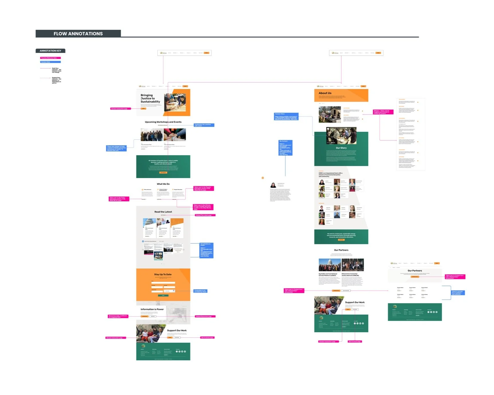
The final step was creating a prototype and detailed annotations to facilitate handoff to the development team.
“I wanted to re-iterate what an awesome job you did for CEED and that I’ve shared your approach to your Figma file with numerous other designers as the model method”
What I Learned
Keeping users in mind, I ensured that my design decisions were based on adding value to every aspect of the experience. When in doubt, I counted on the support of my team for art and technical direction.
The new website was built to be simple, visual, and highly informative for both community members and donors seeking to learn about CEED’s impact.


